More rewards, not more
credit cards
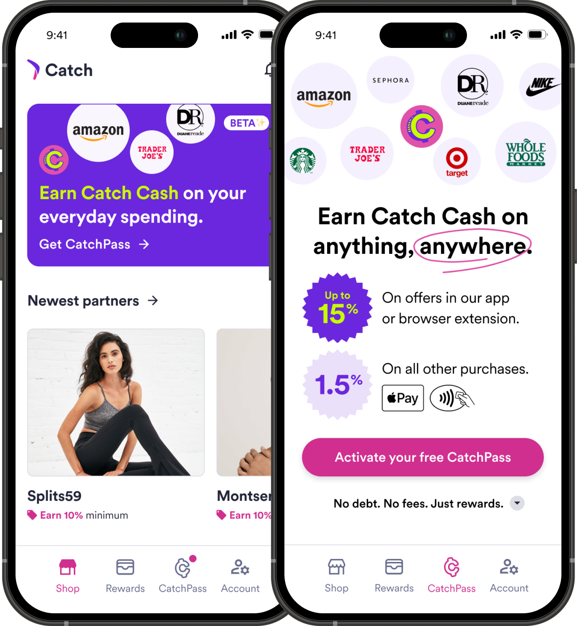
In user research, we found that participants were often overwhelmed by credit card offers and hesitant to open new ones.
To that point, most had associated Catch with "fun" purchases, but using it for more practical spending—especially with Apple Pay—got users excited.